5 Things I’ve Learned as a New Designer

It’s been a couple months since I heard those beautiful words “you’re employed,” and amid the moments of air-punching delight, I find myself still checking over my shoulder to be sure no one is heading my way to say “oops sorry, we made a mistake, see ya.” Is it really so hard to believe I have a job? For a thirtysomething military vet on the backfoot in the turbulent world of graphic design, yes. I felt less disorientated on my first day in front of a radar screen attempting to tell aircraft what to do to avoid each other…no joke.

But I felt the fear and did it anyway, and I’m glad to say, I did something right. Now, almost a year after starting an internship here at MbD, my boss asked me “so how does it feel now that you’re official?” Words actually failed me. I said something lame like “great!” as my inner-child did backflips down the hall and out the door screaming “Yea baby, YEA!!”

Anyway, I’m here to share “5 things I’ve learned about design so far”. This was Phil’s suggestion for my inaugural blog entry, and initially it was hard to sift through my thoughts and find a coherent answer; I am constantly learning, and I believe designers are eternal students of their craft, so only 5 things? That’s tough! When I made a few notes I found this to be a good exercise in reflection, for the sake of progression. So here in no particular order, are 5 things I’ve learned about design:

1. At a press-check, always keep in mind the last thing that the client saw. Case in point, my first ever solo press-check that turned in to a small disaster. I did not take with me the last thing the client had seen, choosing instead to take an older piece of work that had been approved by the client before, so that I could color match to their brand color. When the client received their prints, the response, in a nutshell, was “it doesn’t look a thing like the one you showed me.” The run had to be re-printed, and I needed CPR followed by a few slaps about the head with a large wet fish I keep by my desk. Lucky for me, this time, it was a non-profit, pro bono job where all involved were able take a more lenient stance; and hence, not feed me to the pigs. Projects can get so big and/or stretched over weeks or months, and even things that are done on a recurring basis will have some changes. Every situation is unique. I say again, at a press check, remember what the client is expecting!

2. Tidy up those files for the next poor soul who has to work on them. My second learning point is about file sharing. It took me a while to get to grips with who keeps what files where on the system. It’s quite common to be asked to pull up a certain file from a few years ago and do something with it. For the first few months I was here, my own house-keeping was shameful. I put files where I was pretty sure I would find them again, but could anyone else find them? Nope. You will be pleased to hear that I’m finally getting myself in order, and even putting the job number in the file name. It’s a true marker of progression.

3. Have pride in the work you do. Cover your ass. Be a teamplayer. These nuggets are in the same paragraph for a good reason. I would aim this comment at any new designer, and especially at those still in school. In the classroom, students have a certain amount of possession over their work, and they find this very hard to let go of. I remember an exercise where a dozen or so students made a poster and then passed it on to the next person; at this point of waving goodbye to the document, the creative brief changed and the poster was re-worked. As the poster moved around the classroom I understood what the instructor wanted us to achieve, but now I see it in action daily. Whether I work on something from the ground up, or take it at the last minute to change a single word or put in a different image, I check everything twice at least, and treat it like a last Will and Testament. There’s nothing wrong with a little OCD (I’ve been known to open and re-open a file 4 times to re-check the work before sending it on; with in-house therapy I’m getting that down to 3.) In a studio, it’s about what the studio produces, not the individual.

4. Always second-guess yourself, because the answer will usually be “change it.” As a designer, second-guessing yourself comes with the territory. If we didn’t, we’d be bad at our job. Right before I left school I confided in one of my most respected instructors that I wasn’t sure I could make the decisions I needed to make on my own. I was really concerned that I would have good ideas, but not be able to find the right questions to ask myself to refine the work to something that looked designed! She assured me that I could do it, just stand back and ask questions! Admittedly, my first months here as an intern, I was still having the same battles. When I saw something that looked a little “off” I would always ask myself…is that too bold? straight? bright? light? Does this seem too big? small? loud? quiet? I would then ask the same question of my mentors. And then I started to notice a pattern; 99.9% of the time their answer was of course, “yes it is,” or “yes, it does.” I finally feel confident that the trick is to repeat this action until the elusive Design has emerged. Look for everything that is wrong. Fix those things. Then stop. Now leave it alone. It feels good knowing that I can see things I couldn’t see before. My eye is developing and I’m ecstatic about that!

5. Sleep. The other me, the one from design school, was lucky to go to bed before 3am and rise again in time for class at 8am. I have learned that, although there are times when it is neccessary, or the dreaded design-induced insomina strikes, late nights do not contribute well to a productive day at the studio. So although I’m still a night owl at heart (all my best ideas arrive after 11pm) I have left my vampire days behind in favor of a normal(ish) work week. It’s amazing what can be done before midday after a proper nights sleep!

So there you have it. Thanks for reading. I’m off to tidy some files and second-guess myself some more, while trying to avoid the wet fish eyeballing me from across the desk.

Ciao!
Isla

Tree sculpture grows donations

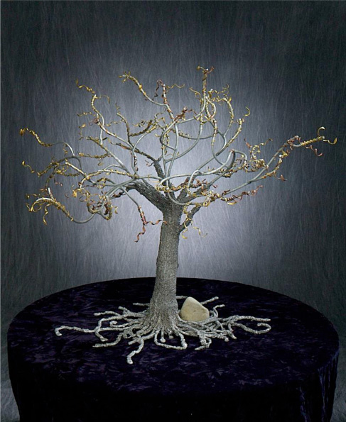
As a board member, volunteer and vendor of the Sacramento Tree Foundation, I had a blast helping to invent this tree. At 3 feet tall (and wide), it holds ‘pledge leaves’, paper cutouts of leaves with contact and commitment information from donors. The Tree Foundation uses it at public outreach events and cultivation events, and it is a stunning piece of art with a fabulous purpose.

For me was the whole process was fun: hearing a request for ‘a tree that hangs on the wall’ and envisioning it to be something grander and more dynamic; finding a sculptor — Josh Kaiser — the best!; working with Josh to figure out the scale, the textures, the roots and the curly elements to hold the paper leaves; visiting an annodizing facility to explore coating/coloring it; unveiling it at a board meeting, and then seeing it in action at William Ishmael’s cultivation event.

I grew up loving fabrics and colors and became an expert in print design. It was a pleasure stretching my knowledge to make this sculpture happen for Sacramento Tree Foundation. I appreciate the opportunity, Josh’s exceptional work, and the pride I feel when I see it on display at the STF office.

You’re invited to see it there, but I recommend you join and add a leaf to the tree. Visit sactree.com or call 916.924.8733 to volunteer or join.

Sculpture of a tree in a gray and silver color, with gold material sculpted around all the branches like ribbons.

Personas

Hats off to CalSTRS, for hiring Cooper Design in San Francisco to do qualitative research on its members. We are excited to phase into a new relationship with CalSTRS as a design resource, in addition to several good in-house and contracted designers. As CalSTRS is one of the largest pension funds in the world, the volume of member communications can be potentially staggering. Determining the target audience, the message, and the point are all critical to the ultimate goal of ‘being of service to the members’.

Enter ‘Personas’. [from Wikipedia]
Personas are fictional characters created to represent the different user types within a targeted demographic, attitude and/or behavior set that might use a site, brand or product in a similar way.

Cooper’s month long interviews of 75 members across the state yielded five personas. Each at a different point in his/her career, at a different level of financial interest and sophistication, and a different need for segments of CalSTRS’ services. We love their approach and it was a pleasure to see it done methodically at a large scale.

The personas were of five different teachers:

  • a young woman, married and busy with a family, who is not the financially-attentive person in the household
  • a mid-career woman; single parent and struggling financially because her ex-husband lost his job
  • a mid-40’s man who made a career change into teaching, bringing existing retirement money and financial savvy
  • a late-career woman, who is trying to figure out the best timing for retirement
  • a retired community college teacher, whose benefits are defined by the years of service and dollars contributed — and who must manage his accounts from a different perspective.

Bringing this Home for Our Clients

We were impressed with the professionalism and thoroughness of the Cooper team. As Phil and I walked away from the meeting we mused how fun it would be to create ‘personas’ for our clients. The reality is we do a ‘lite’ version of this for our clients on each project. We don’t have degrees in anthropology, statistics or psychology and our clients generally need to work within a tighter budget, but we do keep a strong focus on the target audience throughout our process.

We meet with clients from marketing managers to small business owners on a daily basis. At the launch of each project we ask “Who is the audience? Who are the likely buyers? Who would benefit from this, or be moved by this information?” When the answer is “everybody!”, we know there is digging to be done. At that point, designing for ‘everybody’ will mean design for ‘nobody’. Keeping the target audience at the forefront of design and strategy is crucial to making each project successful.

Clarity

Having shared this idea with my sister, who recently signed up to collect Social Security, it sounds like the SSA could benefit from customized messages to well defined target audiences. She’s received several mailings of multi-page letters that drone on, difficult to read and identify the important points. As an attorney, she had the stamina to actually read the pages, and still had trouble understanding them. In this age of information overload, clarity is critical!

How to Think Inside the Box

Graphic illustrations of three different styles of boxes.I think of our client’s projects in the same way I think of boxes. I love interesting boxes: different shapes, different textures, different mechanisms to open, different purposes. You wouldn’t give an engagement ring in a packing box, and you wouldn’t pack computer ram in a velvet jewelry box — unless you are specifically going for an unexpected effect. From a simple packing box to a curved-sides box, to a silk-embroidered covered box, each box has its unique characteristics and purpose.

Design projects are the same, with characteristics and a purpose unique to each. Defining the project means understanding (the optimal) target audience, the goal, the reasons for action (features/benefits), and how this project fits in context with the rest of the project or campaign components so that coherence with the brand is addressed. Printed materials, display graphics, user interface design and packaging all have different criteria, as do the different manufacturing or reproduction methods associated with each. It’s super-critical when those different methods all must represent the product and brand appropriately and consistently!

For example, our branding work with the Sacramento Tree Foundation over the last ten months has included a great group of projects that have asked us to become involved at several levels. Each project was a different ‘box’ to be designed and tailored to a strategy and audience. To have a thorough understanding we participated in developing initial strategy and messaging concepts, and then worked through the design and production phases on many projects in parallel tracks. We’ve been able to create a new look that honors the 25-year-long history and reflects the new human-focused messaging. The success of those projects will play out over the next year, in the varied applications and venues. This process is similar for all clients. By understanding and appreciating the unique purpose of each project that we can create just the right box to manifest your desired outcome.

Graphic illustrations of three boxes, one closed, one open with paper inside, and one open and empty on the inside.Was this post helpful? How do you approach your projects? Do you enjoy delving into each project and refining the problem or do you find it constrictive to your creative process?

You Get What You Pay For

I recently watched a friend of mine go through a process to have a shower door custom made and installed. I had custom glass shelves installed in a kitchen remodel a year before and I was impressed by the precision of the glass company [Dick’s Rancho Glass]. When the friend and her husband got prices from the glass company and from the installation department of a big box store (which I normally shop at), the slightly cheaper price seemed like a reasonable decision. Three door mis-installations later, due mainly to the door manufacturer not measuring and manufacturing the product correctly, and, whoooeee, the $150 they saved has been eaten up by the time spent making and waiting for the appointments for each new installation.

We’ve had that happen with clients as well. They saved ‘a ton’ of money on the photography, design or printing, only to find that some very basic details had not been accounted for. Even simple things like how we make mockups, versus only sending pdf files, have made a big difference. Once you touch the booklet, see the pages as a spread (vs viewing in single page pdf format) and realize that two photos, or two text blocks don’t make sense in context, then important decisions can be addressed. Otherwise, it comes up at the printers proof with a time and cost consequence.

Love those mockups. They reveal more than we’d ever expect, and are so glad they do.

Do you still make mock-ups for your clients? or even for yourselves? How do you avoid those types of mistakes? Even been beat out on a quote and had the client come back to you to do it right? Share your story in the comments below.