Department of Health Care Services (DHCS)
DHCS (the Department of Health Care Services) is the state agency that implements MediCal services to low-income Californians. Its mission is to preserve and improve the physical and mental health of all Californians, accomplished through evidence-based qualitative and quantitative research.
Website
2013-2015
“We need a website that inspires a low-income population to take care of themselves and their families. We must pay careful attention to their needs and their online experience.”

As a ‘from the ground-up’ website, this myWelltopia website development process necessitated a full exploration: creating personas, exploring user journeys, and assessing the taxonomy of information needed by the audience. The team met regularly for two years, from concept through launch. Combined with a social media strategy and ongoing analytics reports, the site continues to be managed by internal staff, and won the GovTech’s Center for Digital Government 2015 Digital Government Achievement Award.
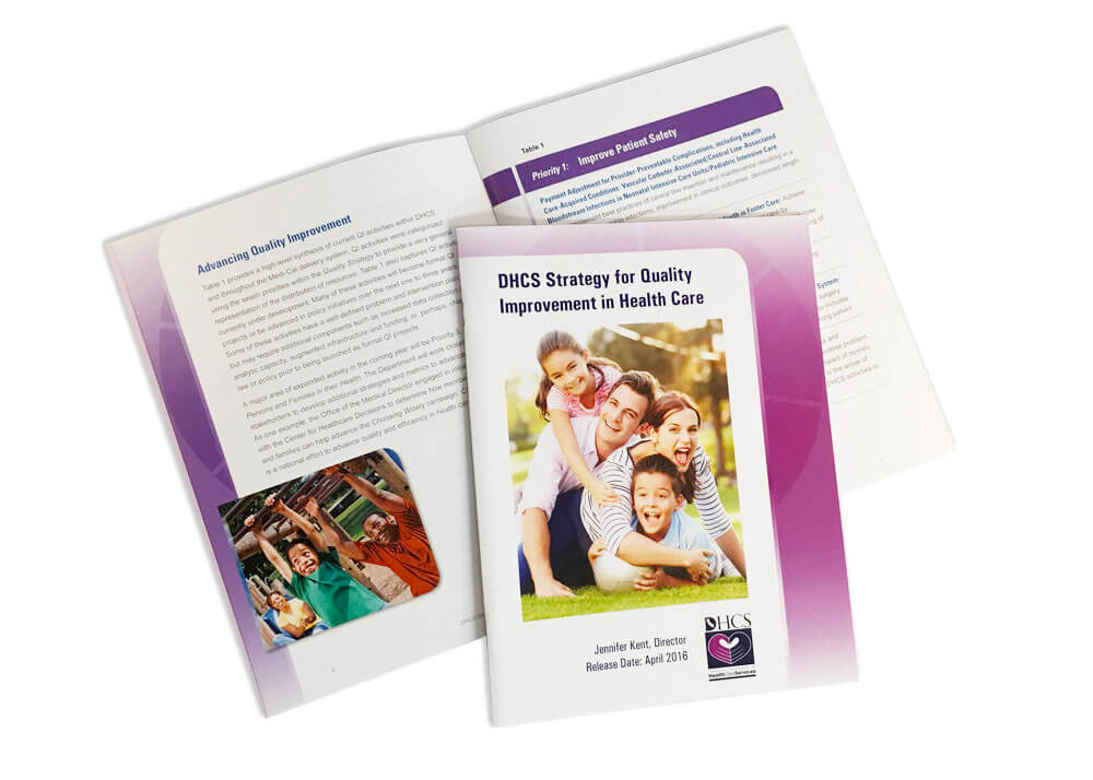
Quality Strategy Document
2015
“We need our uninteresting Word document designed into a better presentation of the report for stakeholders, industry peers and policy holders.”

This Quality Strategy document needed visual structure and the department color palette, and just enough white space and design treatments to make it, readable! It too, has been adapted for a second year, providing a look, that with cover photo variations, will last for years as a signature report.
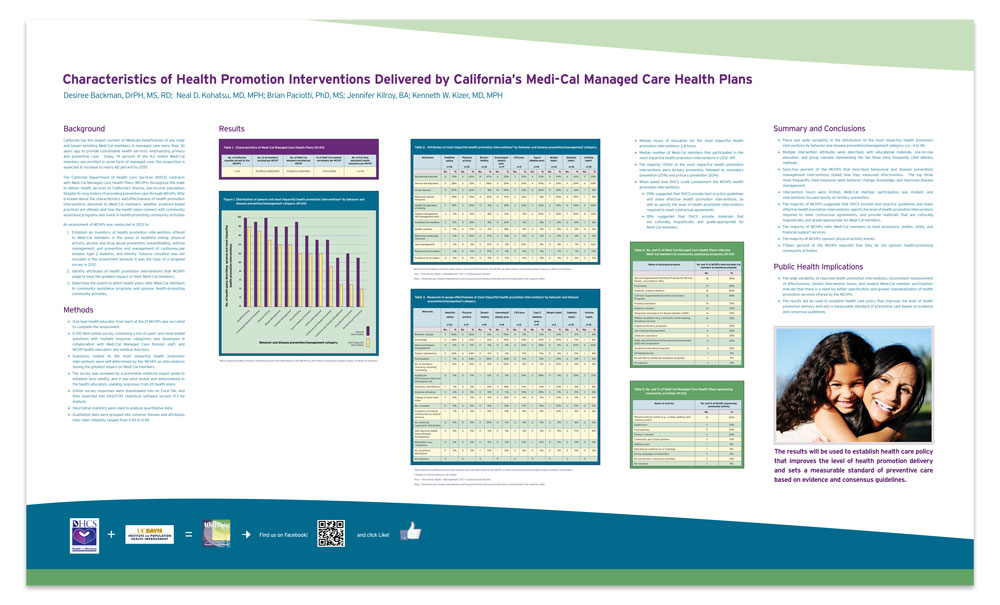
Poster
2014
“We need a poster for an academic conference that stands out from the rest.”

Scientific and research posters typically ignore important principles of hierarchy, legibility and visuals that relate to the topic. We created a poster with the typical ‘a lot’ amount of text, and added photos and edge treatments that tied to other handout materials, including the powerpoint template.
