California Department of Healthcare Services (CDPH)
Toolkit
2003, 2006, 2009
“We need a Toolkit for Community Educators.”
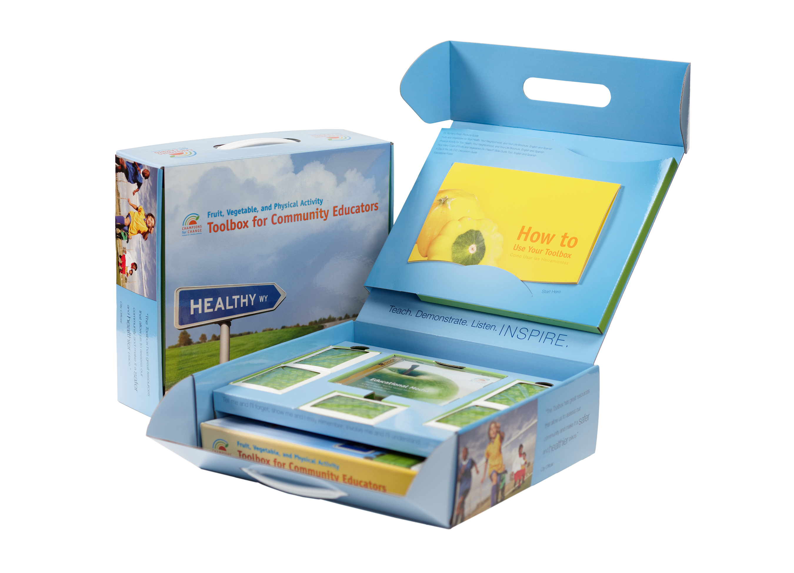
Working with subject-area experts, we designed, produced, (located specialty printers), and coordinated printing for custom color components including: carrying box, binder with 150+ sheets of lessons, phytonutrient-based deck of playing cards, resource materials, and a music CD. This resource has been a successful tool through three rounds of reprinting over ten years.
Healthy Eating Materials
2002 – 2014
“We need culturally-appropriate materials designed for consumer education.”
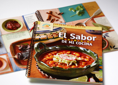
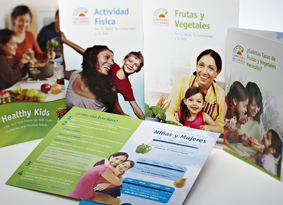
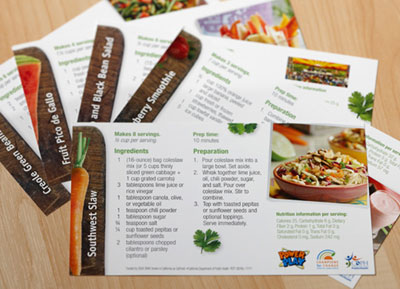
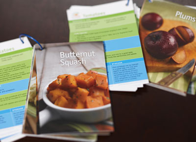
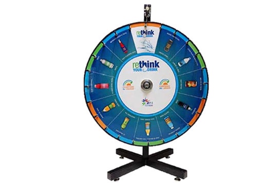
Based on the brand we developed over time, we created a large number of healthy eating and physical activity outreach materials including: brochures, slide guides, cookbooks with custom photography, posters, scrolling banners, logos, full size exhibit displays, prizewheels, tents, and tablecloths for three outreach campaigns: Latino, African American, and Rethink Your Drink.
Reports
2001 – 2009
“We need to communicate with funders, policymakers and stakeholders about all the good work we are doing— in a way that they can absorb.”
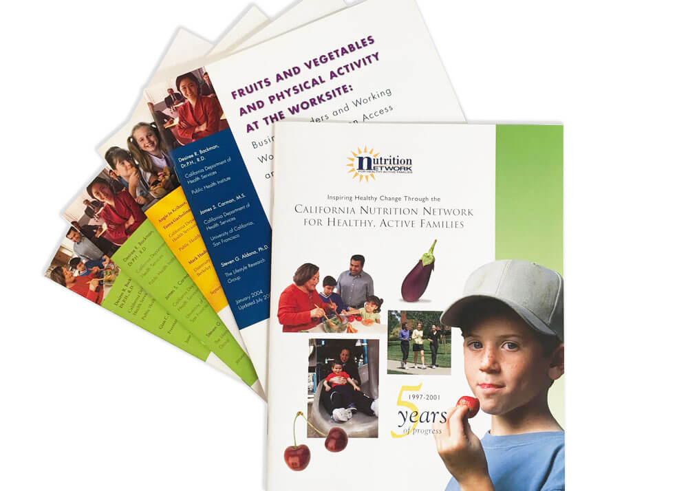
We designed reports, issue briefs and fact sheets that illustrated the progress of programs, including facts, tables and charts, balanced with great photos of the audiences that the programs serve. Always the design balanced the credibility needed for academic audiences with the appealing readability for institutional and policymaker audiences.
